Wednesday, Oct 28, 2020
The redesigned institutional website incorporates many new features and design elements
by Adam Grybowski
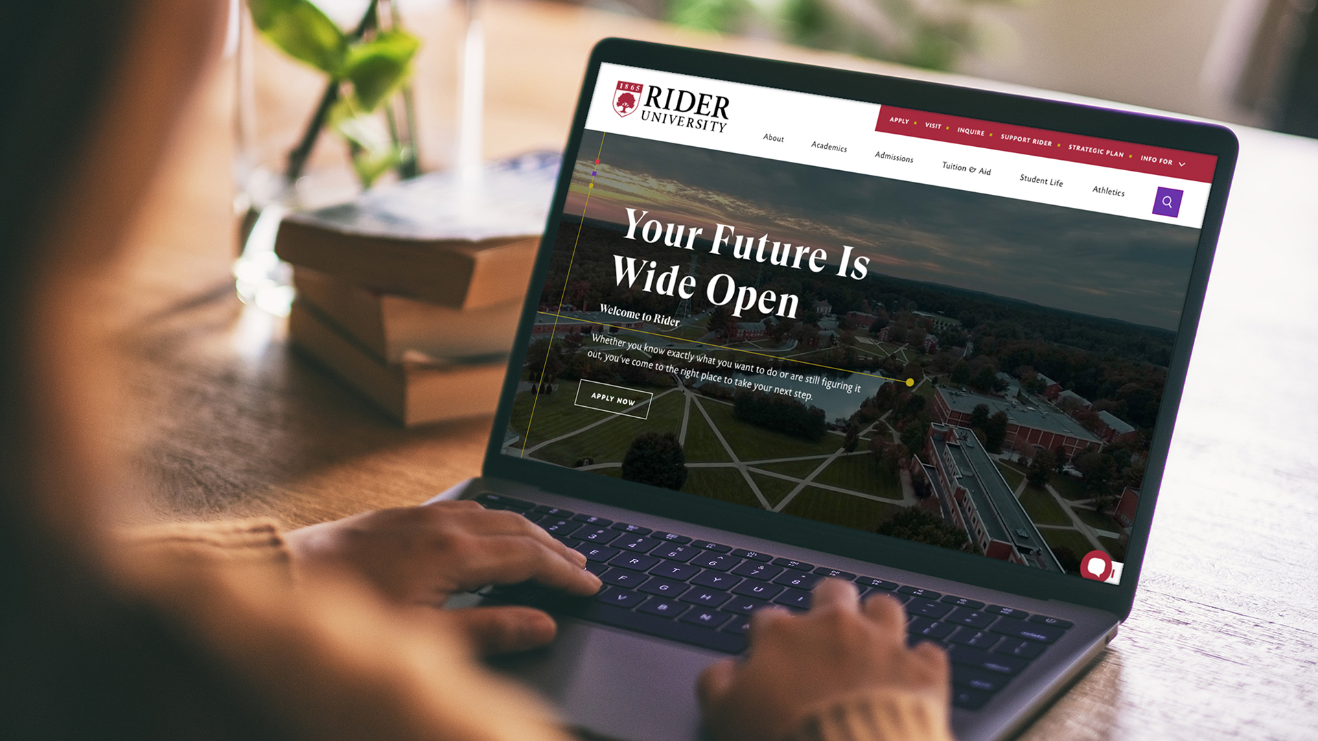
Rider University launched a fully redesigned website on Oct. 28, with improved usability for visitors across all devices and new features created to advance institutional goals.
Among the highlights of the new website are enhanced search powered by Google, a user-friendly academic program finder tool and multilingual translation. The site also features updated photography, content, and design and interactive elements that reflect the University’s brand identity.
“The overall experience of our new website is a leap forward for the University,” says Kristine A. Brown, associate vice president for University Marketing and Communications. “Visitors to rider.edu are going to find beautiful design and engaging storytelling, and are also going to be able to more easily find the information they are seeking.”
The project was a collaboration between University Marketing and Communications, the creative agency 160over90 and web development agency KWALL, with input from key stakeholders, such as students, faculty and staff. Five students— studying computer science, marketing and business communication — gained hands-on experience working on the new website. Based on the Drupal 8 platform, the new website grew out of foundational research and follows best practices in web design and user experience principles.
"With KWALL and 160over90's vast expertise and roots in higher education, we couldn't have asked for better partners for this project," says Pamela Abbazia, Rider's executive director of marketing and digital strategy. “Our new website is a crucial piece in our marketing and communication efforts, and I couldn’t be more excited to finally share it with our community, including prospective students and their families.”
Abbazia says that while the site launch is a major milestone, the plan calls for continual updates and improvements as technology and best practices evolve.

